
The baillie consultancy
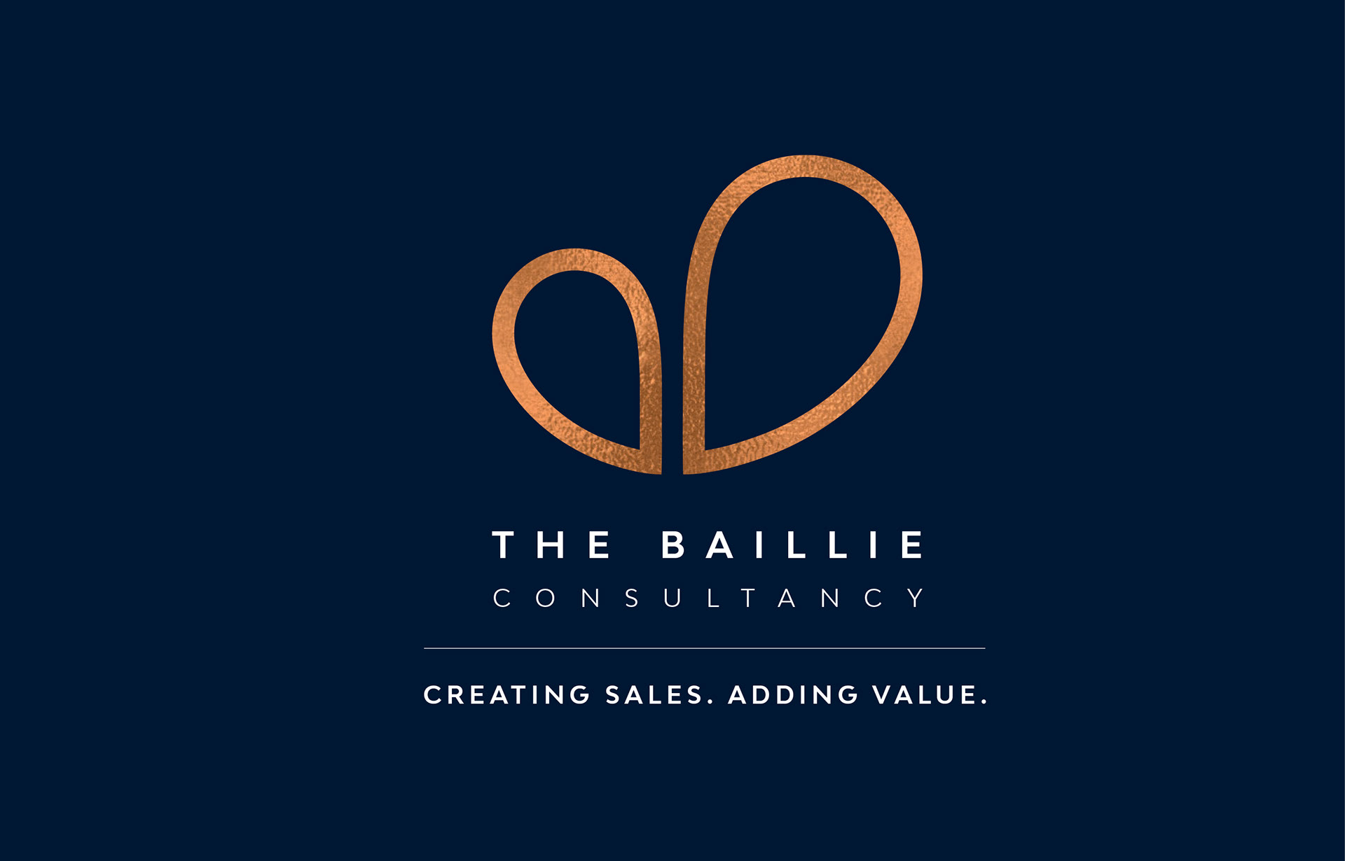
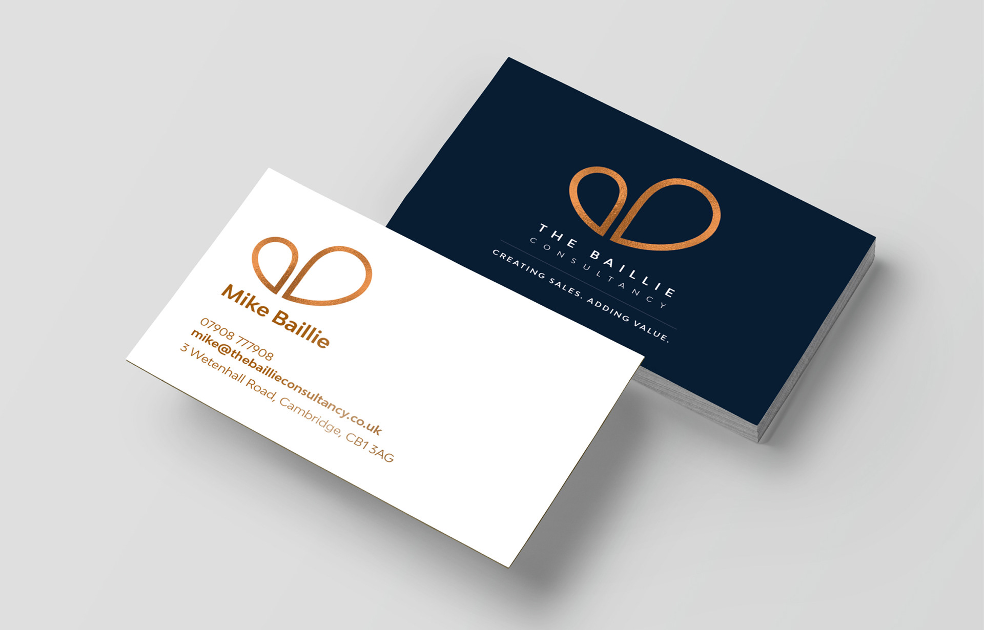
The idea behind this logo was to create something simple and elegant, that looked modern and professional. The mark has been created by using the negative space of the capital B when combined with the capital C. When flipped, it also creates elegant speech bubbles, highlighting the communication element of the brand. The colours can still be defined, but it would look really high-class on a dark luxe card and navy background with bronze foil on the mark.


Here we have the other options that were explored